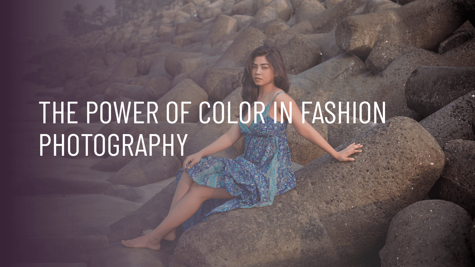
Color is an essential element in fashion photography, as it can convey different moods, emotions, and messages. Well-executed use of color can enhance the visual appeal of an image and captivate the viewer’s attention. For instance, a bright and vibrant color palette can create a sense of energy and excitement, while muted and monochromatic tones can convey sophistication and elegance. In fashion photography, color is often used to complement the clothing, makeup, and accessories of the models, or to create a contrast that highlights specific features or details.
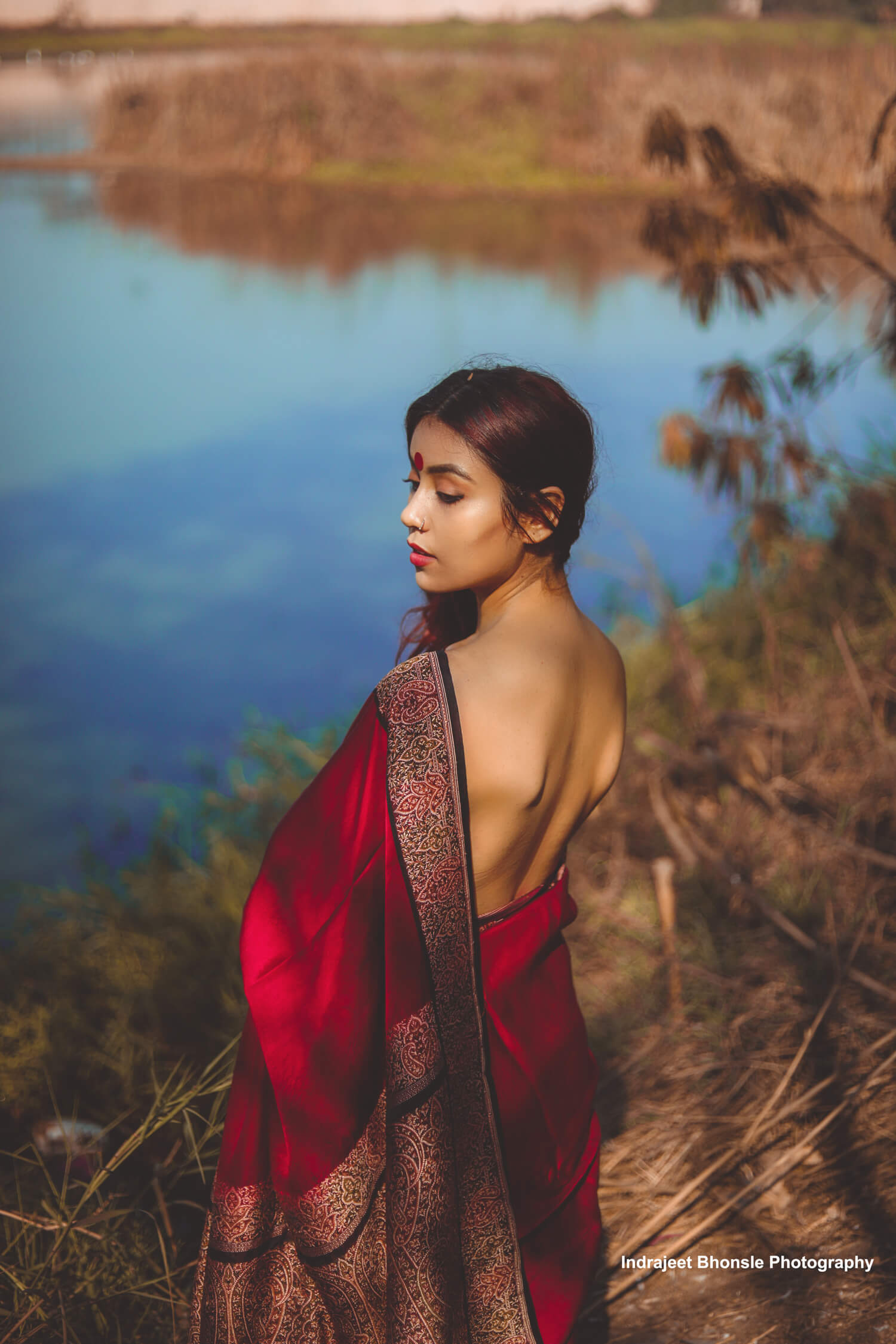
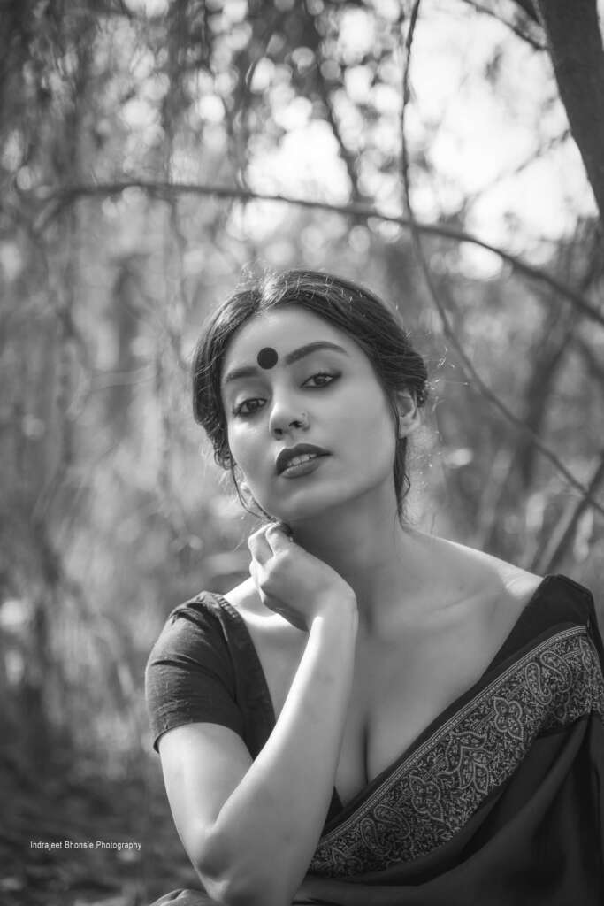
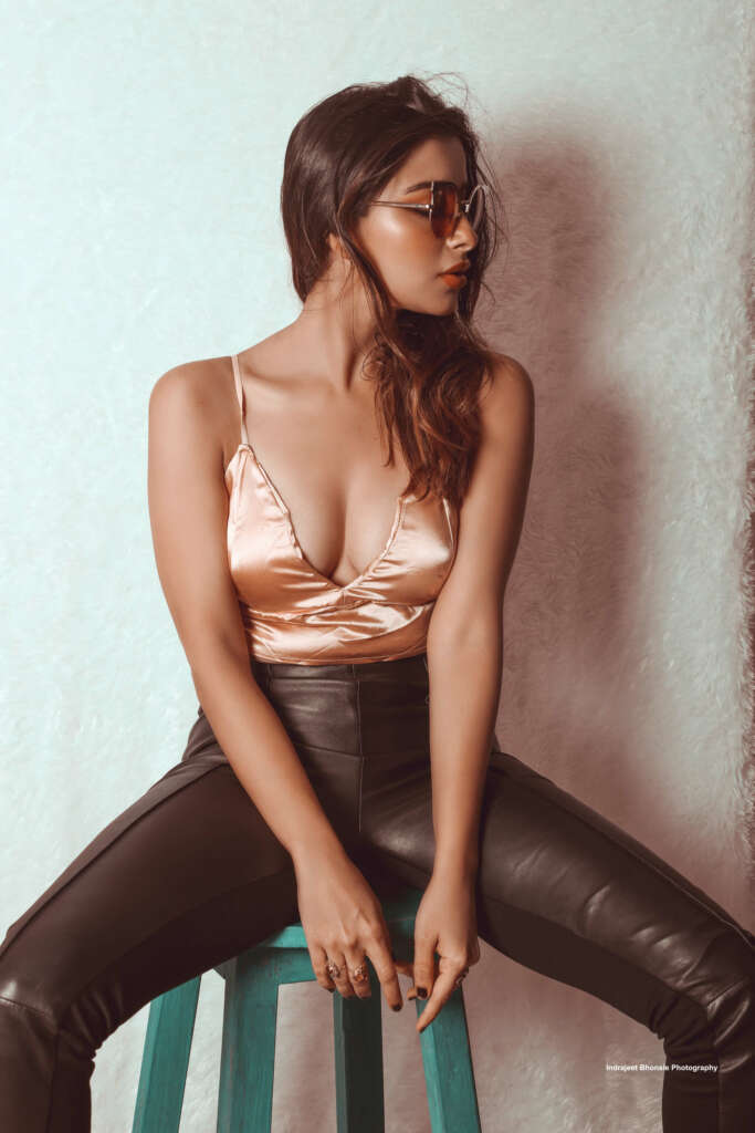
For example, look at these two photos:Courtesy- Indrajeet BhonsaleCourtesy- Indrajeet Bhonsale
A red dress against a blue background creates a striking visual impact, while a black and white portrait conveys timeless beauty. The model, clothing and makeup are the same in the photos, but they convey different moods. Thus, mastering the use of color in fashion photography is crucial for creating compelling and impactful images that resonate with the viewer.
Different Ways To Use Color In Fashion Photography
Here are some ways to use color in fashion photography:
1. Setting the mood
Colors have the power to evoke different moods and emotions. Warm colors like red and yellow create a sense of excitement and passion, while cool colors like blue and green convey calmness, tranquility, and sophistication. For example, a red dress in a fashion photograph can make the viewer feel passionate and energetic, while a blue dress can create a sense of tranquility and calmness.
2. Creating contrast
The right use of contrasting colors can make a photograph stand out and grab attention. Contrasting colors are opposite to each other on the color wheel, such as red and green, yellow and purple or blue and orange. When used together, these colors have a strong visual impact and can be used to draw attention to a specific aspect of the photograph. For example, a model wearing a purple or magenta dress against a yellow background can create a striking contrast and make the photograph visually appealing.
3. Conveying brand identity
Brands use colors to establish their identity and convey their values and personality. The choice of colors for a brand’s logo should align with the brand’s image, vision and mission, and target audience while also being visually appealing and distinctive.Color Wheel
For example, the luxury brand Chanel is associated with black and white colors, which convey sophistication, elegance, and timelessness. The use of black and white in their fashion photography creates a sense of luxury and exclusivity. On the other hand, the brand H&M uses bright and vibrant colors in their fashion photography to convey their youthful and trendy image.
4. Enhancing the composition
The right use of color can enhance the composition of a photograph and create a sense of balance and harmony. Colors can be used to create a focal point or lead the viewer’s eye. A photograph with a monochromatic color scheme (using shades of the same color) can create a sense of unity and harmony, while a photograph with complementary colors can create a sense of balance and stability.
Here, you can observe how one color is in focus and a monochromatic scheme is followed. It gives a cohesive and elegant look.Courtesy- Indrajeet Bhonsale
5. Creating visual interest
Color can be used to create visual interest and add depth to a photograph. For example, a photograph with multiple shades and tones of a single color can create a sense of texture and dimension, making the photograph more visually appealing. Similarly, using different colors in the foreground and background can create a sense of depth and perspective in a video.
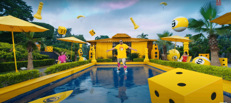
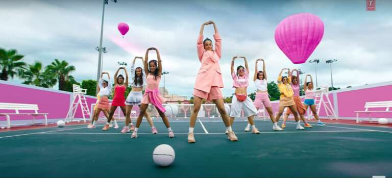
For example, in the song “First Kiss” by Honey Singh and Ipsitaa, you can see how they have used a single color for the whole setup in different shots. The co-actors are wearing different shades of yellow/pink, and their makeup is coordinated too.Courtesy- T-SeriesCourtesy- T-Series
6. Enhancing skin tones
The right use of color can enhance skin tones and make the model look more attractive. For instance, warm colors like orange and red can make the skin look more radiant and healthier, while cool colors like blue and green can create a sense of peacefulness and tranquility.
7. Creating a cultural context
Colors can be used to create a cultural context and convey the traditions and values of a particular community or region. A fashion photograph featuring traditional Indian clothing may use vibrant colors like red, yellow, and green, which are commonly associated with Indian culture. If you see a model wearing a green lehenga for wedding shoot, you can easily guess the background.
8. Conveying a message
Colors can be used to convey a message or idea through the photograph. For example, a photograph featuring a model wearing a green outfit may be used to convey a message of sustainability and environmentalism. Similarly, Mamaearth’s logo uses blue and green as its primary colors to promote their mission- Healthy people on a healthy planet. In their advertisements, they use the same set of light colors to showcase sustainable and environment-friendly products.Your Good Hair Day Starts Here With Mamaearth Onion Hair Shampoo
9. Reflectingcurrent trends
Colors can reflect current fashion trends and be used to appeal to a particular audience. For example, pastel colors were a popular trend in fashion photography a few years ago, while bold and bright colors are currently in vogue. As the competition is increasing in fashion industry, you should be aware of the trending colors to make the best use of it.
Every year, Pantone, the Color Institute, selects a color based on past cultural analysis. The chosen color represents the upcoming year’s fashion, interior, art, design and print trends. Pantone has chosen Viva Magenta as the color theme of 2023. Brands have already started to incorporate this color.You can visit our blog on “plan your shoots with the colour theme of 2023” and learn how you can use it to enhance your shoots
Overall, the use of color in fashion photography is a nuanced and complex process that requires a deep understanding of color theory and design principles. The right use of color can create a powerful emotional impact, convey meaning, and tell a story through the photographs, making it a crucial aspect of fashion photography. By considering all these factors, you can create a cohesive and visually appealing fashion shoots.
And if you want shoots to be done for your brand, you can hire a video production company. IndieVisual (that’s us!) provides custom video production services at affordable pricing. We work with a curated team of local expert creators who will help you show your products in the best possible light.
Reach out to us at hello@34.100.129.6 for any doubts or further conversations!
Looking to work on Exciting Video Campaigns for Big brands and Startups?
We’ve got the projects, and we’ll handle the admin. So you can focus on being creative – and leave the rest to us.