Colour has an important role to play in visual design. Choosing and blending colours is an integral part of photography. Besides the lighting, camera setting and props, what makes a photograph outstanding? It’s the primary colour ratio, or the colour palettes present in the frame.Colour has the power to influence the audience. It affects and evokes emotions.
Why Should Photographers Focus on Their Use of Colour in Photography?
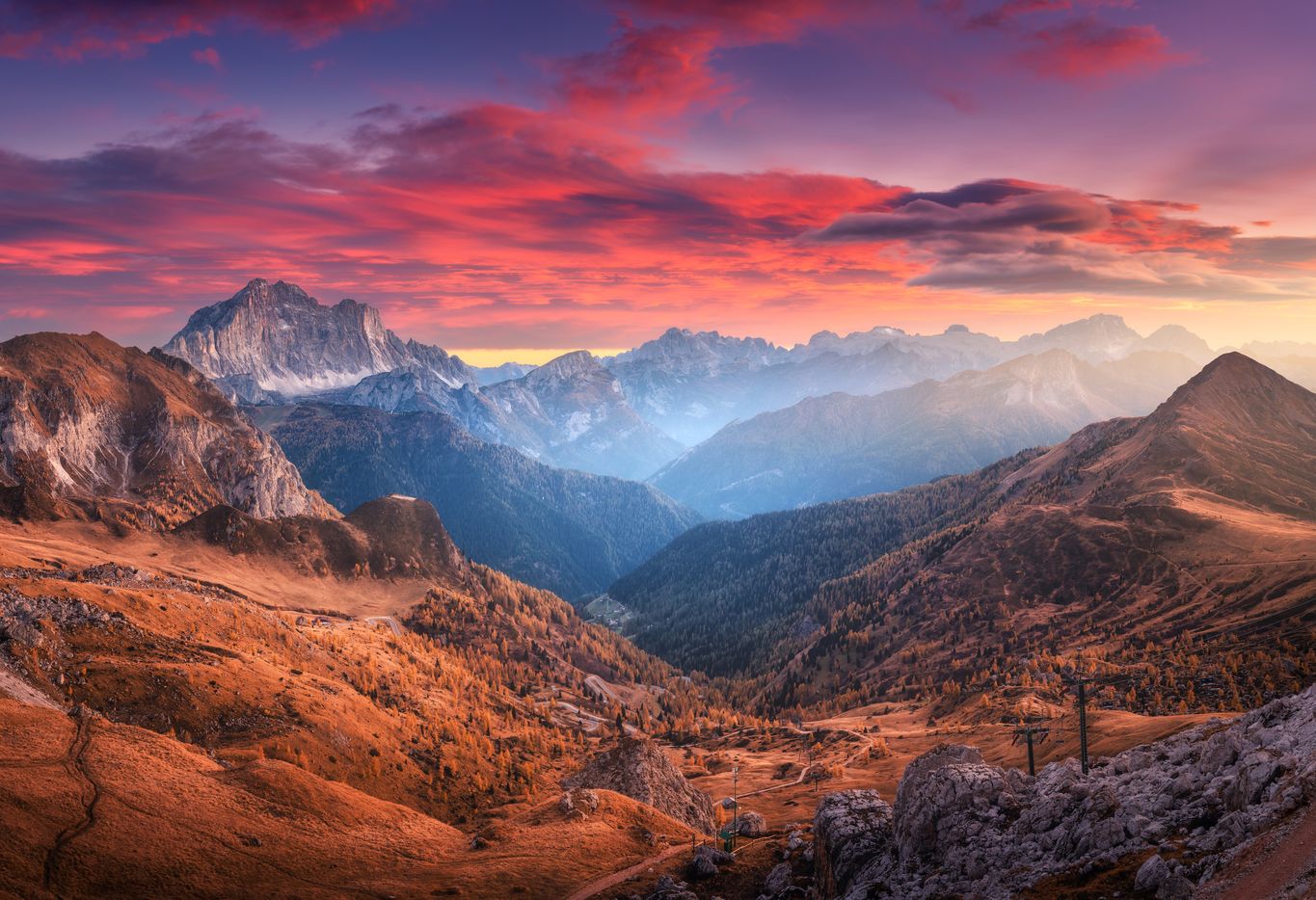
Colour grabs attention. It can be used to guide your viewer to the parts of the image where you want them to focus. Like in the image below, the viewer’s attention will automatically be drawn to the colours of the sky – and then to the contrasting colours on the fields and mountains.Colour in photography plays a major role in composition, affects balance, and determines the weight of visual elements. Bright colours, for example, are perceived as happy, fresh, and joyful. Dark colours are associated with sadness or fear. Warm colours may create a romantic or nostalgic atmosphere, while cold colours are more neutral. Contrasting colours in photograph can be used to make a visual eye-catching and enhance the story-telling.If you want to understand the basics of colour grading in photography, take a look into this amazing session by Joanna Kustra.One way to begin on this journey is to learn about trending colours. Every year, Pantone, the Colour Institute, selects a colour based on past cultural analysis. The chosen colour represents the upcoming year’s fashion, interior, art, design and print trends.
A Little History About Pantone
Back in 1963, the Pantone Colour System originated to solve the problem of complicated colour matching in the printing industry. After a while, Pantone devised the simplest way to classify and match colours. Every colour was given a number to classify it.In 2000, the Pantone Colour Institute started announcing the Pantone Colour of the Year – after studying colour trends throughout the year. It takes into consideration various features of fashion, marketing, social media and even politics.It became a trendsetting concept for designing, art, branding and marketing as a whole. Since then, the announcement of Pantone Colour of the Year is awaited with excitement and anticipation every December.
The Colour Theme of 2023
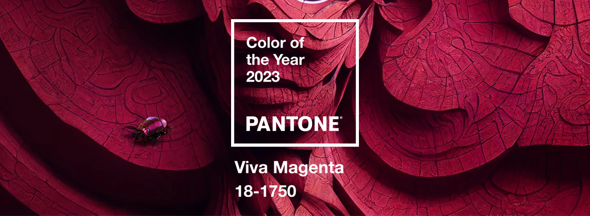
Pantone has unveiled Viva Magenta as the colour theme of 2023. It is described as an “unconventional shade for an unconventional time”. Viva Magenta is a colour representing strength and vigour. Think of it as crimson red with a pink undertone.
Image Courtesy of PantoneViva Magenta is a strong eye-grabbing colour. It can overpower visuals if not used thoughtfully. However, it also has the potential to make a bold statement.For photographers related to fashion or any creative domain, it is important to know the colour theme of the year. Since it is a colour trend forecast, many brands might plan a new look in tune with the new colour. As a photographer, you can propose this shade to advertisers, art directors, designers and clients to incorporate it when collaborating with them.You can incorporate this shade to your upcoming works in the following ways:
Shoots against Viva Magenta coloured Interiors and Home Decor (walls, upholsteries, curtains, linens, artefacts)
Model shoots dressed up in Viva Magenta coloured attires
Shoots of products in the said colour like cosmetics, accessories, food (cakes and desserts)
Is it a gimmick, or a trend that one should observe and follow? You be the judge. But definitely you will now know why everyone is using Viva Magenta in their projects.Planning your next shoot? Make it vivacious with Viva Magenta!
Looking to work on Exciting Video Campaigns for Big brands and Startups?
We’ve got the projects, and we’ll handle the admin. So you can focus on being creative – and leave the rest to us.